Script by Frank Miller, art by Frank Miller and Klaus Janson (original coloring by Lynn Varley). All illustrations are ©DC Comics. For a complete list of all books reviewed in this blog, please visit the
index page.
Another instant hit by the Graphitti Designs team!
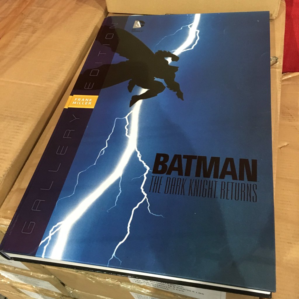
Although dated March 2016 in the credit page, this book was issued in May 2016 by Graphitti Designs under the DC/Vertigo label (ISBN: 978-1-4012-6443-7, 13.5 x 21 inches or 34 x 53 cm for the slipcase, $275). This limited signed edition (275 copies, mine is #41 or #46 it is hard to tell) comes with a sturdy debossed slipcase with debossed taped-spine. It is still advertised on the
Graphitti Design store as limited to 250 copies. This edition features an exclusive sequentially numbered page signed by Frank Miller. Notice that the illustration of the signature page is not featured in the regular editions as such (but it is an illustration included in the extra section).
 |
| the signature page |
 |
| it is definitely #46 on the cardboard box, but here it seems to be numbered #41 |
Below are pictures of the regular and variant cover editions produced by Graphitti Designs (both issued without the slipcase), and a picture for size comparison with the
Absolute slipcase edition and the
10th Anniversary slipcase edition.
 |
| regular edition |
 |
| variant cover edition |
 |
| left hand side, the already massive Absolute edition, right hand side, the 10th Anniversary edition |
The limited signed edition features the same cover than the regular edition, but the spine building is different (debossed taped-spine).
The inner book (13 x 20 inches or 33 x 51 cm, 216 pages) was printed on thick mat paper. Second and third of cover feature the same background illustration. There are also pictures of the sewn binding (the book has been printed in China).
 |
| second of cover |
 |
| seams at the middle of the book |
 |
| third of cover |
 |
| the signature plate is the first opening page |
This book, referenced as Graphitti Designs Gallery Edition #6, has been designed by Brainchild Studios and edited by Bob Chapman & Joseph Melchior. There are pictures below explaining how at Graphitti Designs they have sourced the original art, and how they have handled the scanning process.
 |
| table of contents |
 |
| right hand side, original art scan of the cover of the first 1986 Warner TPB edition |
The main section of the book, i.e.
Batman The Dark Knight Returns originally published in four issues in 1986, features all four original covers. Like it is explain in Graphitti Designs statement above, over 75% of the original material has been retrieved.
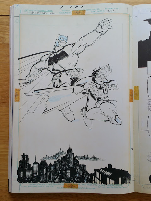
Based on 47 pages of art (46 interior pages + the cover), there were 188 pages to hunt down. I have counted 49 missing original pages, printed in shades of grey instead in the book. So indeed we have 74% of the original pages scanned in this edition, plus extra original art excerpts from Miller re-inking. Out of these 49 pages, 42 are printed reduced in size, 8 x 12 inches or 20 x 30 cm instead of 12 x 18 inches or 30 x 46 cm). I have asked Graphitti Designs about this choice, here is their response: "
Since these books are focused on the presentation of the original art, we make pages that are not source from the originals smaller. This gives greater focus to the pages sourced from the originals".
- pages 12-13-17-23-26-27-32-35-36 from issue #1 (page 1 being the cover)
- pages 7-11-21-22-30-32-33-34-36-39-40-45 from issue #2
- pages 6-15-16-18-22-30-31-43 from issue #3
- pages 4-6-8-9-11-15-16-17-22-24-31-39-41 from issue #4
 |
| left hand side a "missing" page printed reduced in size |
The remaining seven missing pages, are printed if full size (12 x 18 inches or 30 x 46 cm) on overlays:
- pages 2-9-17-27-32-35 from issue #3
- page 26 from issue #4
 |
| right hand side, overlay of page 26 of issue #4, left hand side, Miller original re-inked panels from the same page |
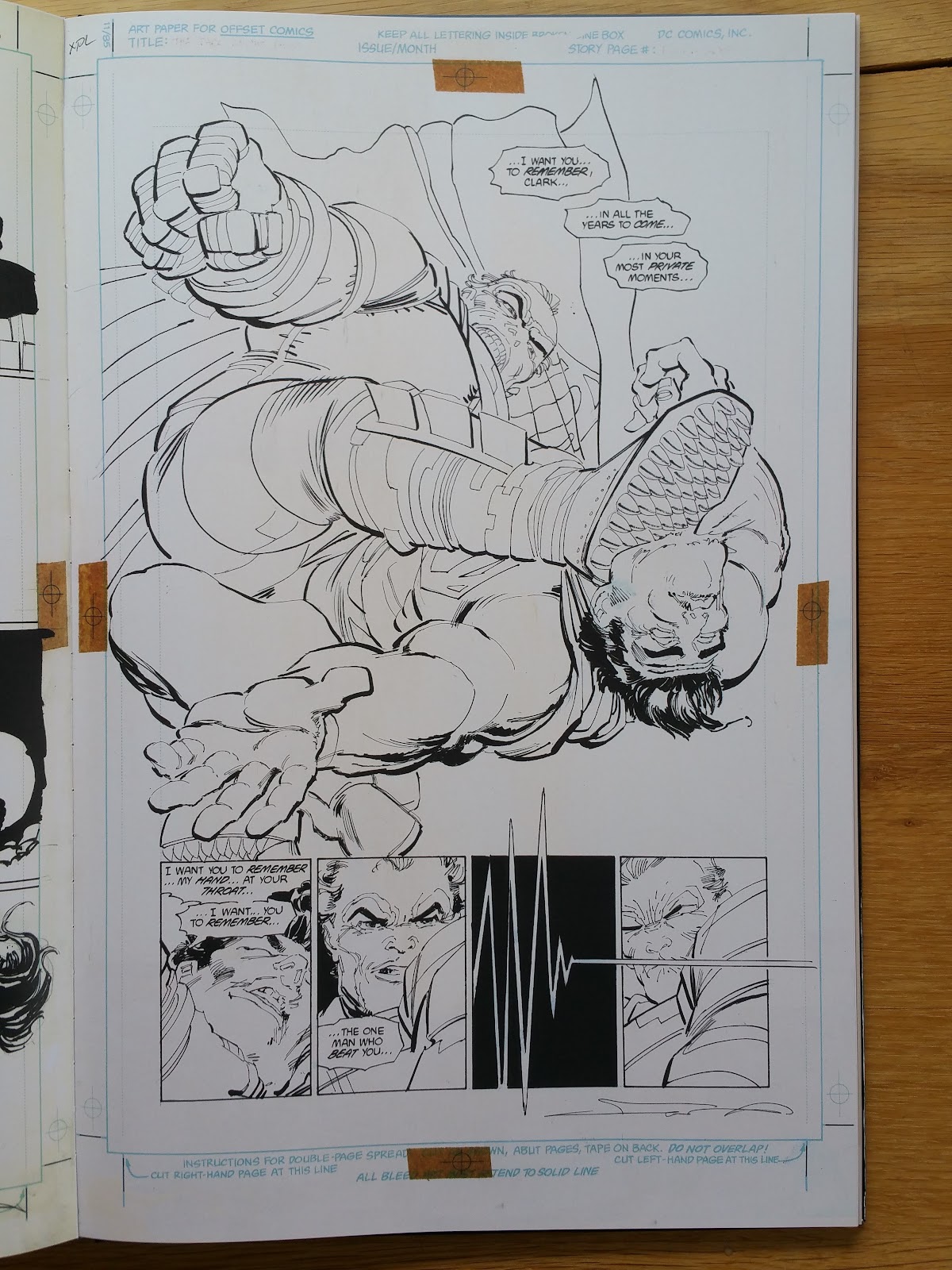
There are many overlays used in this book (I have counted 30 of them, including the extra section), to compare Klaus Janson original inking to Frank Miller re-inked panels, or to compare Frank Miller's pencils to the final inked page:
- page 1 (cover) from issue #1, 2 and 3
- pages 2-3-4-8-9-13-14-17-23-24-26-27-34-35-37-38-39-44-46-47 from issue #3
- pages 21-25-26-27-39-41 from issue #4
Let's start with issue #1:
 |
| original cover for issue #1 with overlay on |
 |
| and without the overlay |
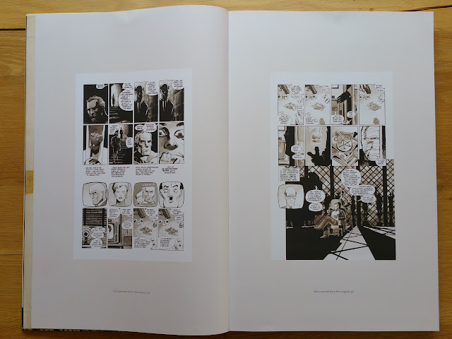 |
| page 12 & 13 from issue #1 |
 |
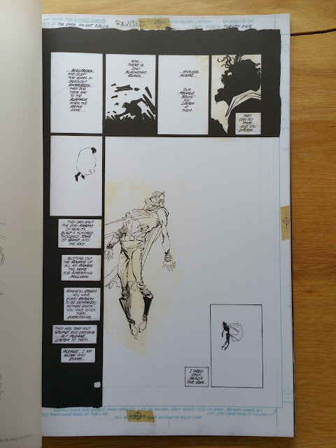
| an iconic missing original page printed in shades of grey |
 |
| a zoom on a panel to judge of the high quality of the scanning process |
Now some pictures of issue #2:
 |
| again the cover with it's "final page' overlay |
 |
| and beneath the overlay Frank Miller's original pencils |
 |
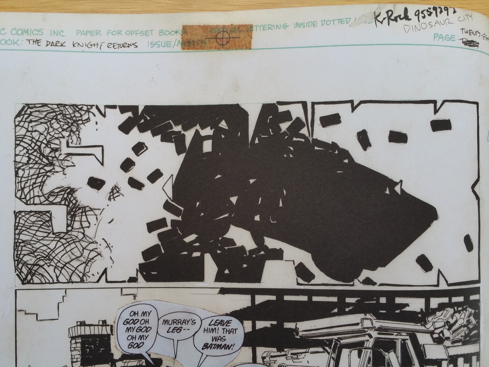
| the lucky owner of this page had it signed by both Klaus Janson and Frank Miller |
 |
| this page always gives me the shiver, and it constitues the point where I realized this story was a masterpiece |
Now let's move on to
issue #3 where Frank Miller started to re-inked Klaus Janson work. There are some very interesting insights on this topic (as well as other pictures of interior art) at the
13th dimension website.
 |
| cover for issue #3 with its overlay |
 |
| zoom on what we see in transparency |
 |
| without the overlay |
 |
| left hand side: Frank Miller re-inked and below the final art on overlay |
On some pictures I have used white paper sheets to better show Frank Miller's re-work on original Janson inking.
 |
| Miller re-work to the right |
 |
| the page used for the cover of this Gallery edition |
 |
| to the left, Miller's re-work |
 |
| to the right, Miller has massively re-inked this page (also see the two zooms below) |
Below are another side by side comparison between Miller and Janson inking (Miller re-work to the left), ...
... and between the original art before and after the captions are included on the page (you can click on any picture to enlarge it):
This time the overlays show Klaus Janson original inks on the final page re-inked by Miller (see below):
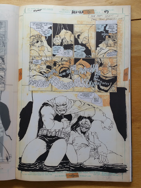 |
| there is a side by side comparison of this page in the extra section |
And now we finish the main material description with issue #4:
 |
| no overlay for this cover |
Another Janson/Miller inking comparison on these three enlarged panels:
 |
| to the right the overlay ... |
 |
| ... and below it, Klaus Janson original inking |
 |
| Klaus Janson inking |
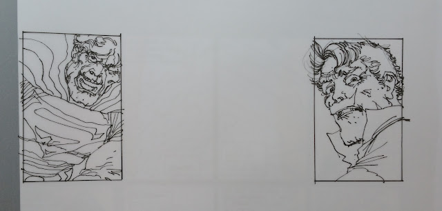 |
| Frank Miller re-work (notice the changes in the eye of both characters) |
 |
| we see here how previous material is reused |
The extra section is 19 pages long (including two gatefold illustrations and the last overlay), its content is detailed in the third picture:
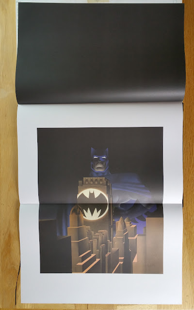 |
| gatefold colored cover for Warner TPB |
 |
| Fan Boy #4 with Sergio Aragones |
 |
| side by side comparison of page 47 of issue #3 |


The signed edition's cover looks soon much better compare to the standard edition!! it's a good buy!
ReplyDeleteAnd I have checked with Graphitti Designs, the Ronin signed GE has also the same design than this signed GE. I will post pictures of the Ronin signed GE on the associated article this evening (pictures taken by Graphitti)
DeleteWas waiting for you to do a review on this! You did not disappoint! Keep it up.
ReplyDeleteThanks for your kind word, I will!!
DeleteExcellent review! I got the standard edition myself, it's a beautiful book, but boy that limited edition looks especially nice!
ReplyDeleteReally fascinating to see the original art, especially Miller's re-inks.
Next up for me is the Sin City Curators Edition, which I understand will be an even bigger book!
Yes, it is also next up for me too unless Mike Mignola Amazing Screw-on Head AE is published before.
Deletemerci encore pour cette très bonne review, perso j'ai la version standard qui me satisfait pleinement ! super bouquin , surtout étonnant quand on compare les les retouches de Miller par rapport à l'encrage initial de Janson bien en dessous il est vrai. continuez !
ReplyDeleteGreat review! Was surprised how large the book is compared to other IDW artist editions. Do you have a twitter or instagram account of pictures of books you have reviewed?
ReplyDeleteYes these Graphitti Designs editions are massives. No sorry I don't have an instagram account, and on twitter I only post links to these reviews.
DeleteThis is great! I'm the owner of edition #47 of 275 of this book and I can back up everything that's said here. What an INCREDIBLE volume.
ReplyDeleteand all that in addition to the fact that this is one of the greatest story ever told ;)
DeleteI am not agree with the editor decission to print in minor scale the pages cant been scanned from original art. I think the book deserve the same size to a better read experience (just adding a note as in the IDW editions). obviously is cheaper printing the lower size, but in this kind of expensive books is a pain to see the withe of the paper:) Great review as always
ReplyDeleteFeR
Thanks!
DeleteWhy did Frank Miller re-ink the pages? They look horrible compared to Janson's work
ReplyDeleteIt is mostly suggestive (for my part I prefer Miller's finished art compared to Janson), but I think Miller's work is more adequate for an "end of the world/swan song" story. Janson's work is too clean in comparison. I really like The Dark Knight, and the Joker spectral look at the end of their confrontation (they are indeed old men).
DeleteThanks for taking the time to review this content and create such an amazing and thorough document of the book.
ReplyDeleteThis is one of the very few, very rare items in my collection that I will NEVER sell.
Side note: My slipcover signed gallery edition also has the numbering wrong. I think it's 241 but the box has 245. Nice to know I'm not the only one. Clearly the packaging team was drunk that day.
Thank you for your kind comments. These gallery editions are indeed a work of art and love.
ReplyDeleteWhat a gorgeous book, thank you for sharing. Is a beautiful piece of art. I am from Argentina. Is really difficult given our economy and government to get our hands on one of these books, this edition is no longer available. But I am about to the the Sandman signed. Question. Are these limited signed editions actually Signed by the authors? Or is it just a scan? I am asking because a signature from Alan Moore or Gaiman is a treasure for me and I think this is one of the few ways to get one. I was able to meet FM at a convention 5 years ago and he was so kind to sign my copy of year one i could not believe it.
ReplyDeleteDear Gabriel. Yes these editions are usually genuinely signed by the author (not scanned), author singular. Indeed, they are only signed by the artist (unless he is also the writer like FM). For example my LOEG Gallery edition is only signed by O'Neill. But it seems that for Sandman you will also have Gaiman signature as well.
ReplyDelete