This article also deals with the 2005, and 2012 DC Batman Year One Deluxe US editions.
 |
| illustration used for the 1988 TPB edition |
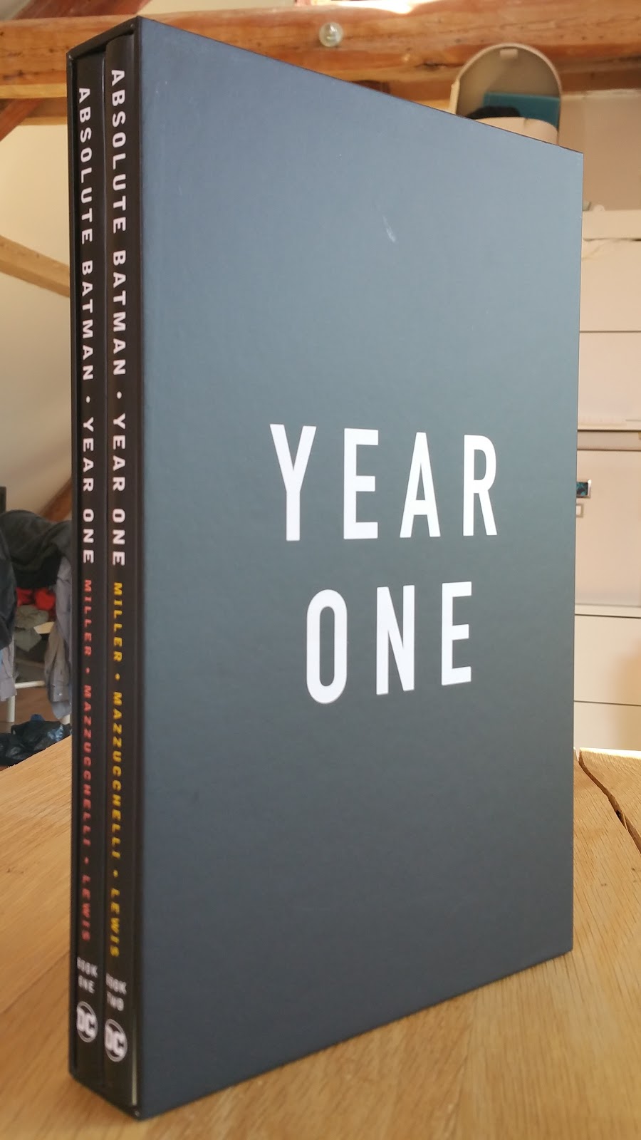
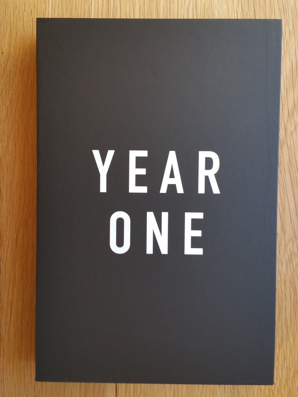
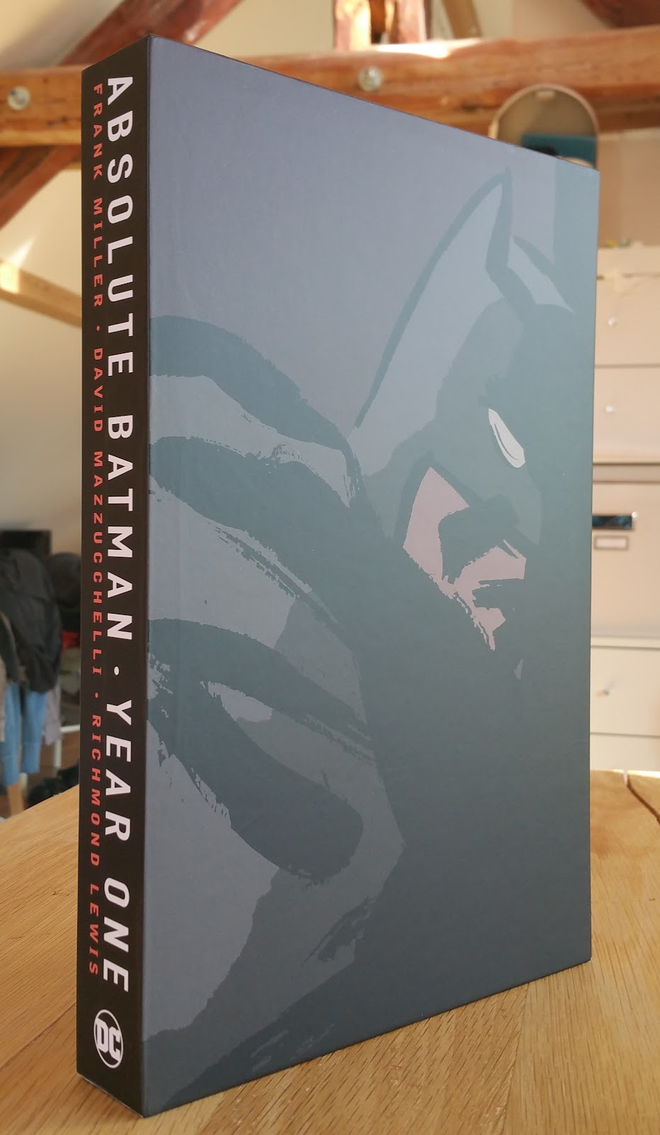
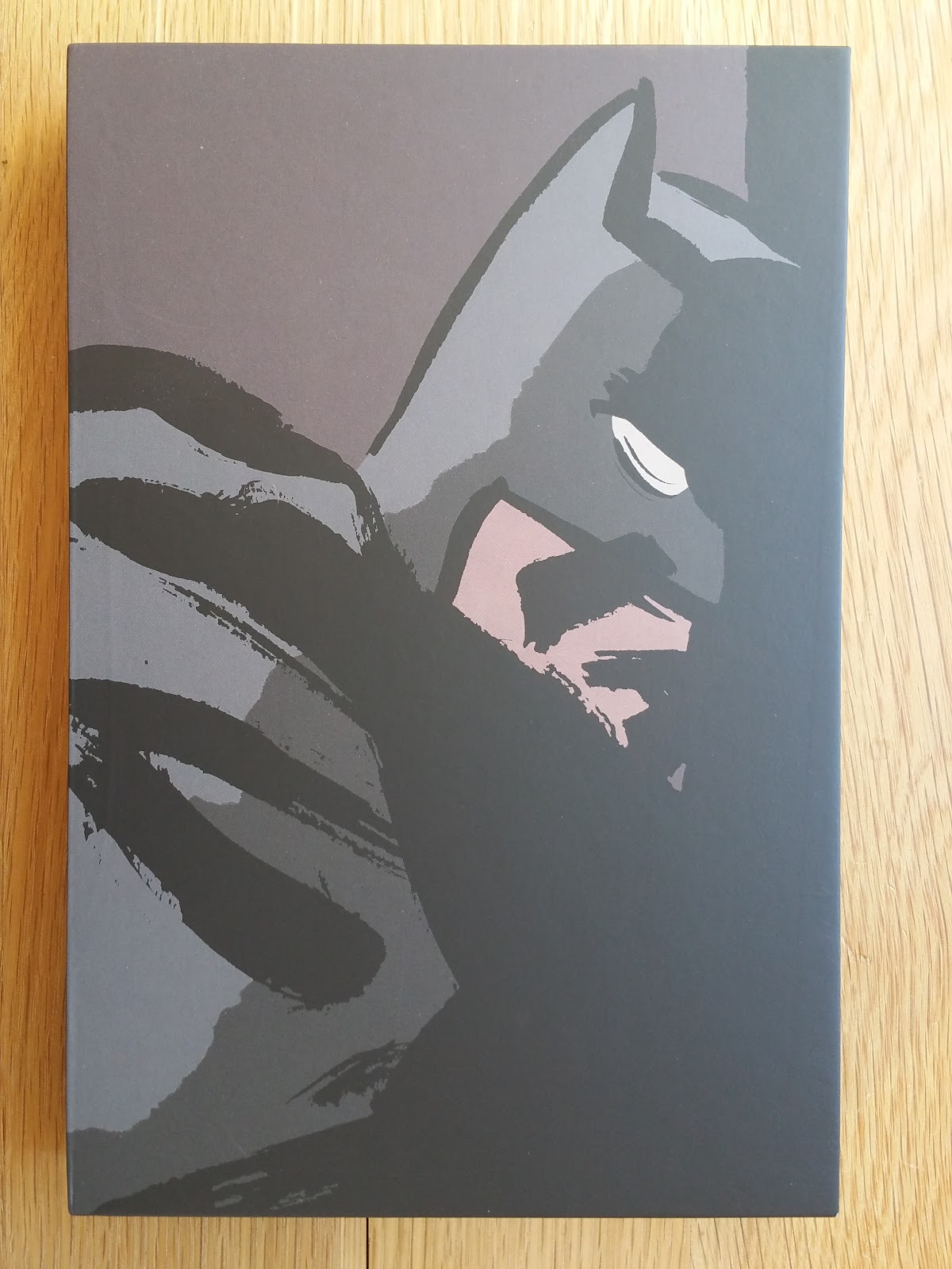
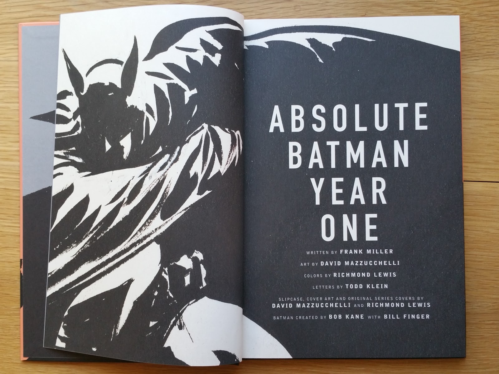
This slipcase edition was published in November 2016 by DC Comics (ISBN 978-1-4012-4379-1, 8.5 x 12.8 inches, 21.5 x 32.5 cm, $125 cover price). My copy is a first print.

The slipcase comprises two hardcover books (book one and book two are written on the spine), each featuring a black bookmark ribbon. This edition was printed and bound in china. There is a picture below for size comparison with Batman Year One 2012 Deluxe Edition. This edition was designed by Damian Ryland and edited by Scott Nybakken.
 |
| to the left book one, to the right book two |
 |
| back covers of the two volumes |
 |
| size comparison between book two and the 2012 Deluxe edition |
 |
| binding of book one |
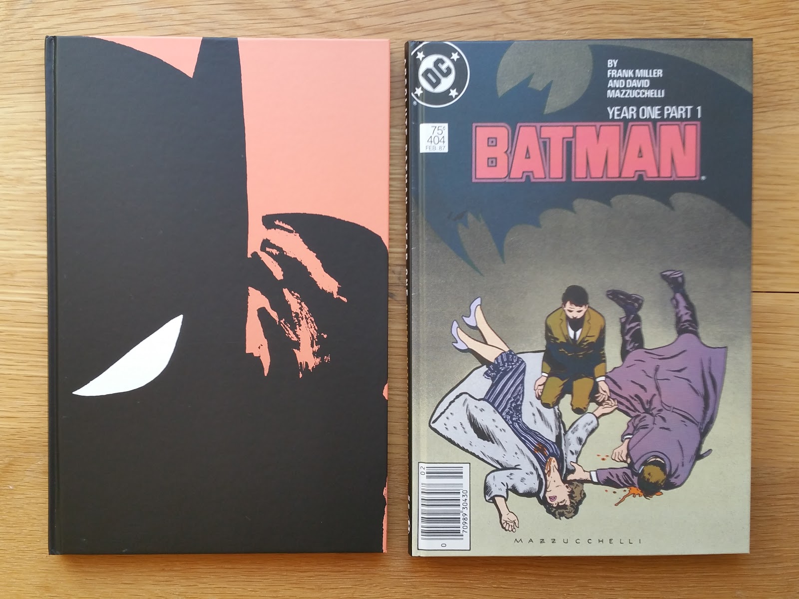
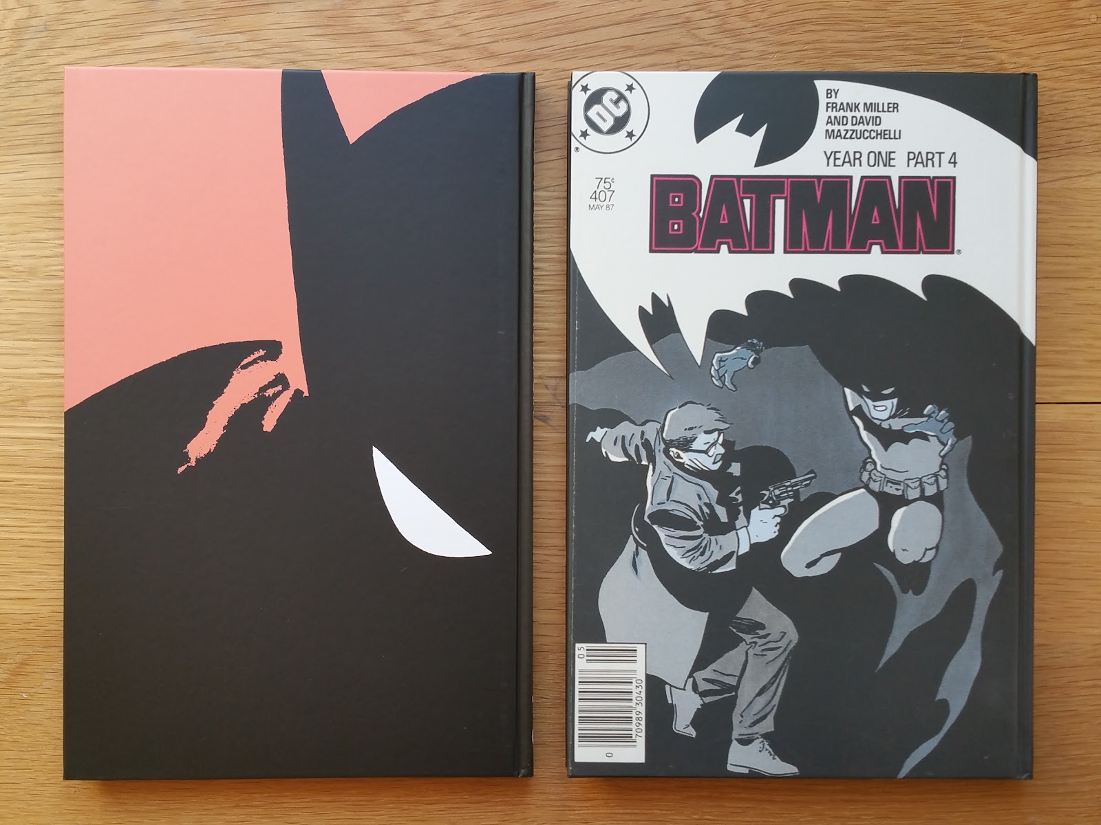
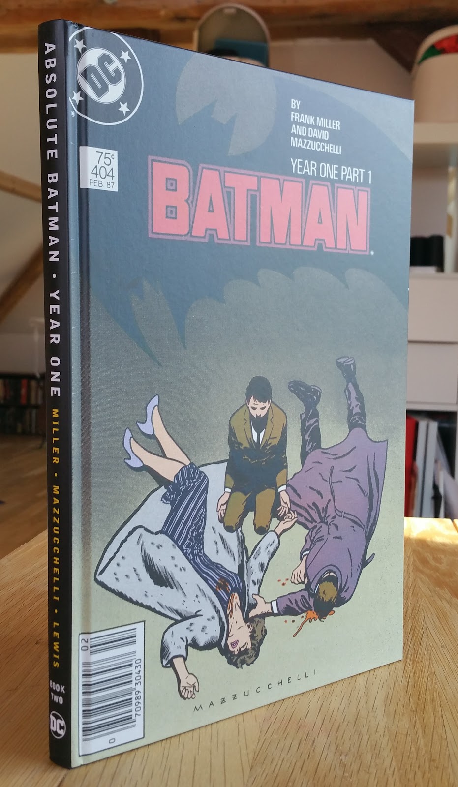
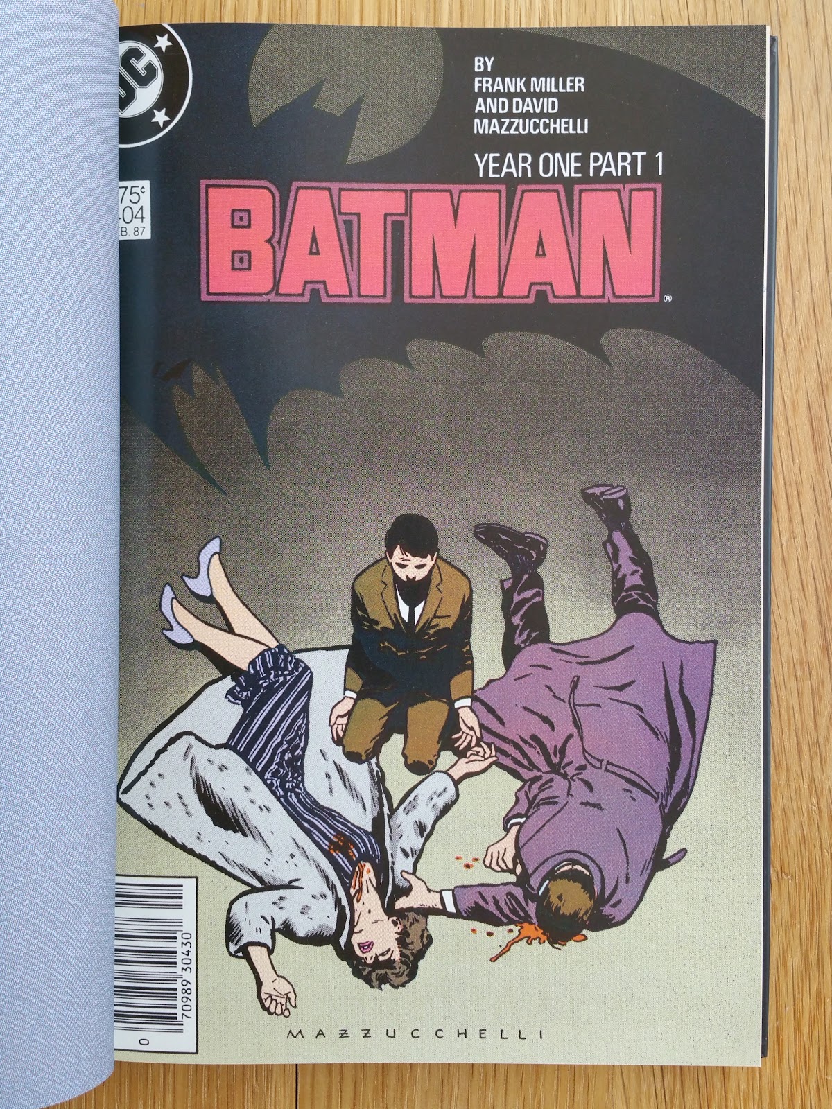
Now let's take a look at Book One (128 pages):


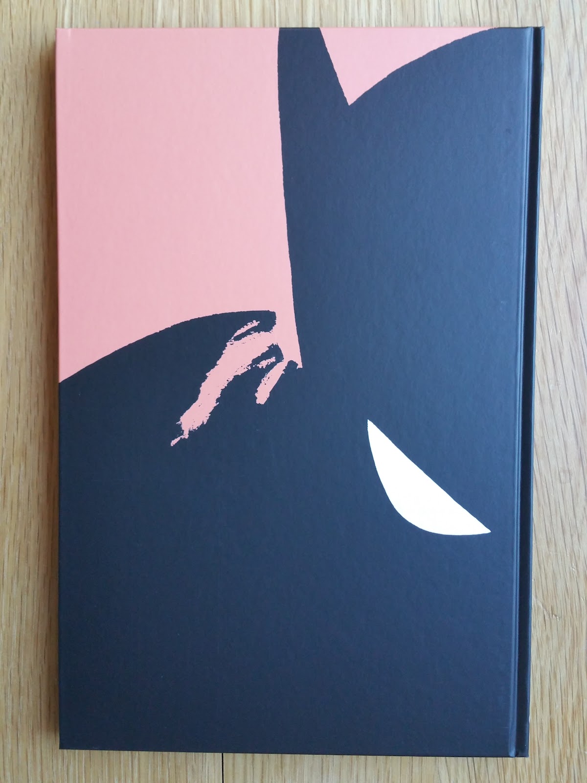
Cover illustration (front and back) originates from the first 1988 collected edition. Second and third of cover use the same illustration with a light grey background (from the cover of the second DC hardcover collected edition). The 1988 original introduction written by Denny O'Neil, as well as Frank Miller afterword are included in book one.


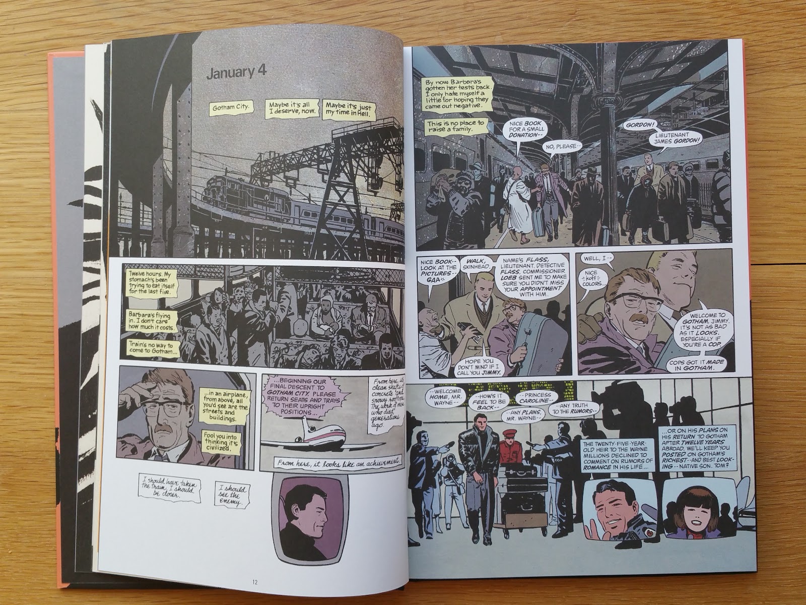
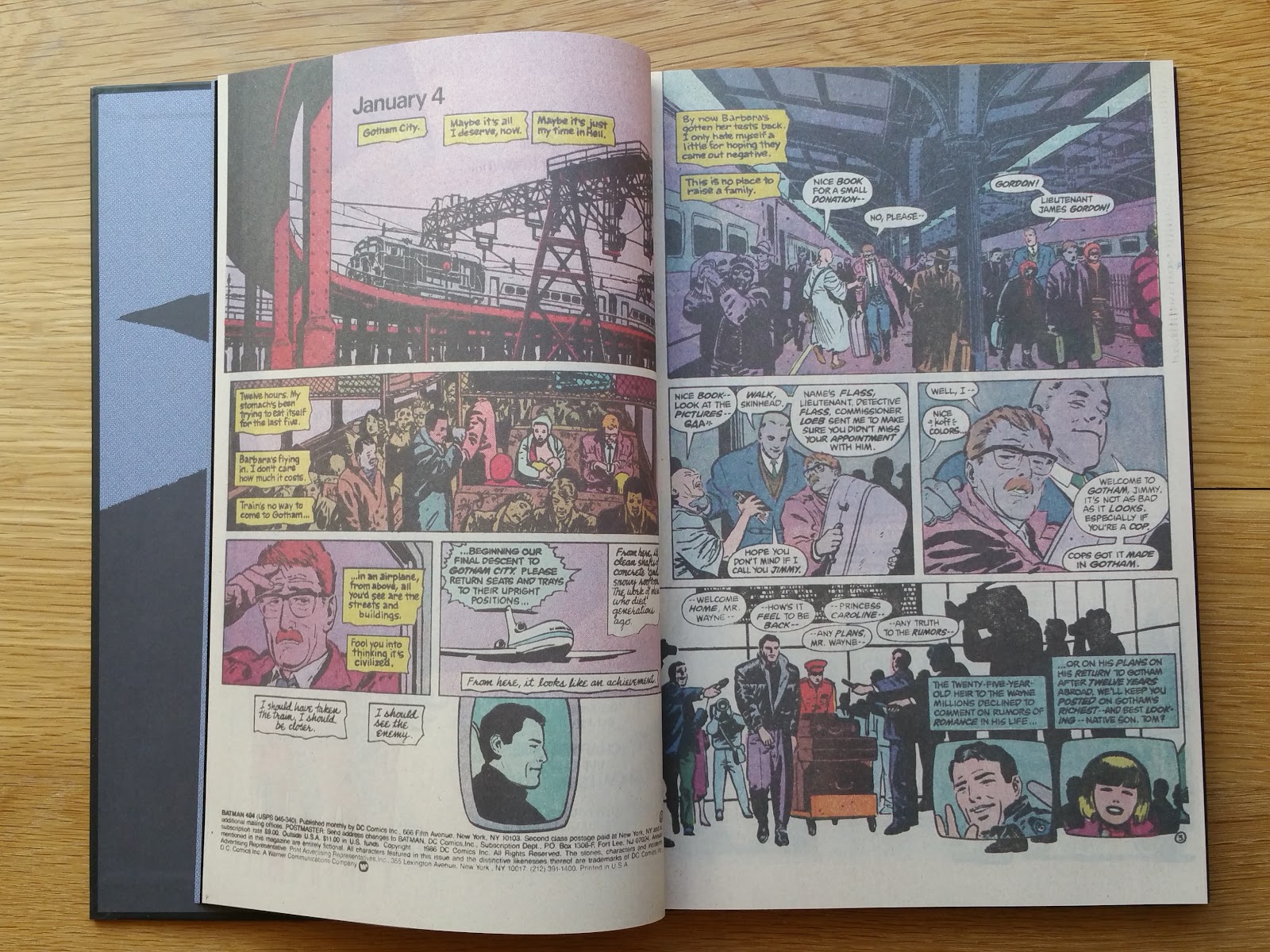
The main part of book one reprints the original four issues 1987 mini-series (Batman #404-407) on thick white mat paper, with all pages "rescanned from the original board". The result is in my eyes very similar to the 2005/2012 Deluxe editions.
Here from top to bottom, book one of this absolute edition, 2012 deluxe edition and 2005 edition.

The examples below show that in the absolute edition, the colors are closer to the original comics, although there are still sometimes important differences.
 |
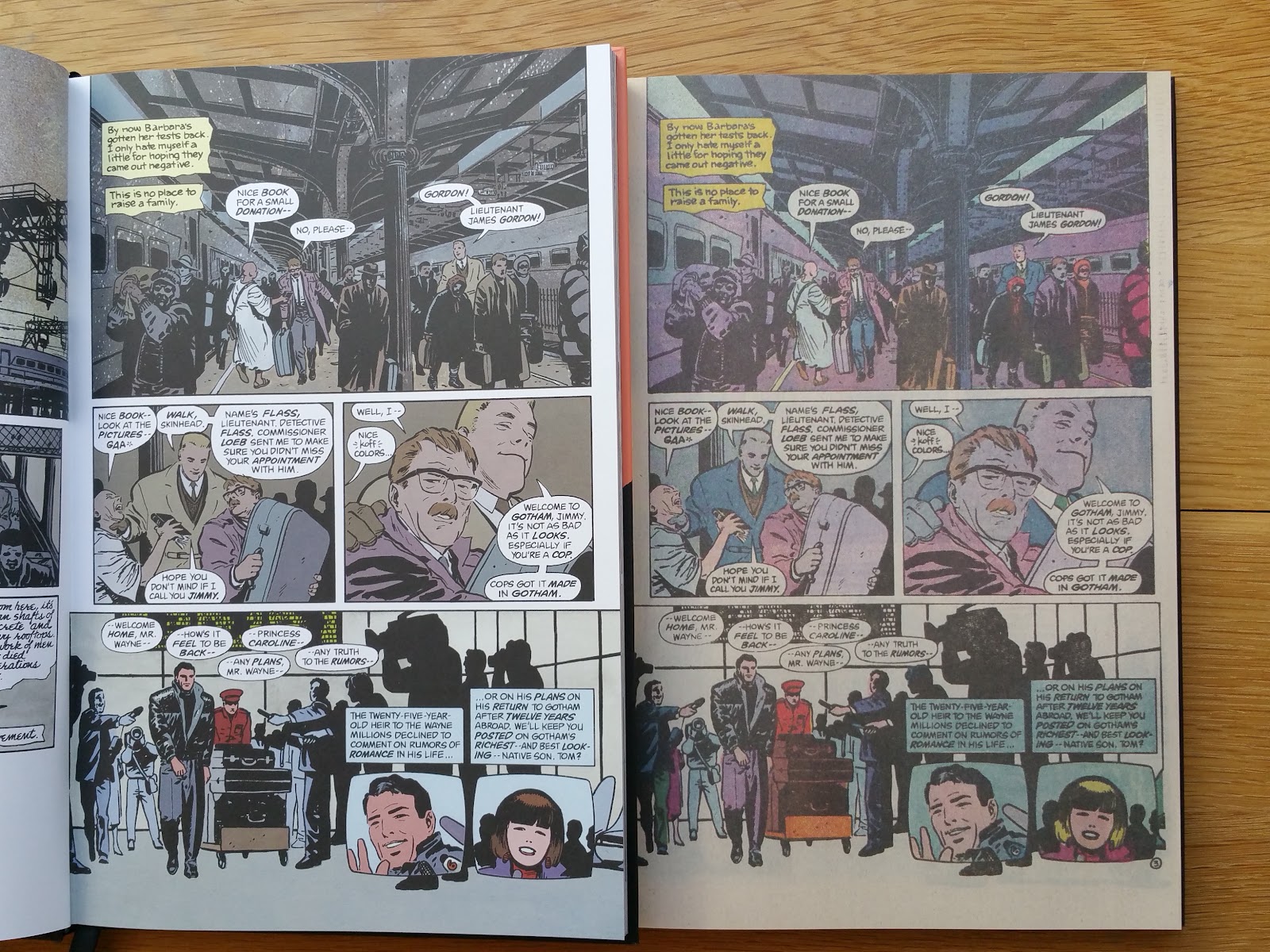
| scan from the original comics as presented in book 2 of this absolute edition |
 |
| scan from the recolored 1988 first collected edition (French edition here) |
And here is the same panel from book one of the absolute edition where colors are closer to the original comics (except for one of the mics and the journalist hair).
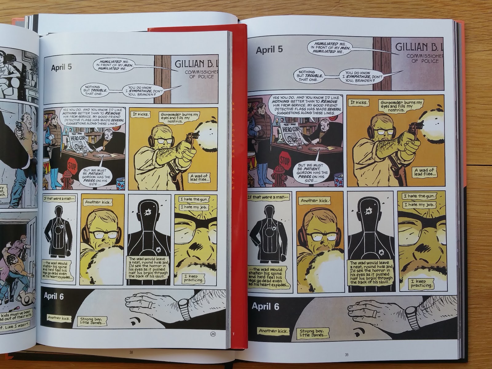
Below are compared another page between book one (left hand side, 1988 "blue-line coloring" from the first collected edition) and book two (right hand side, 1987 original coloring) of this absolute edition, with important differences in the choice of colors:


Another point to notice is the fact that some pages show more art in all collected edition since 1988:
 |
| above from 1987 original material, below from all collected edition since 1988 |
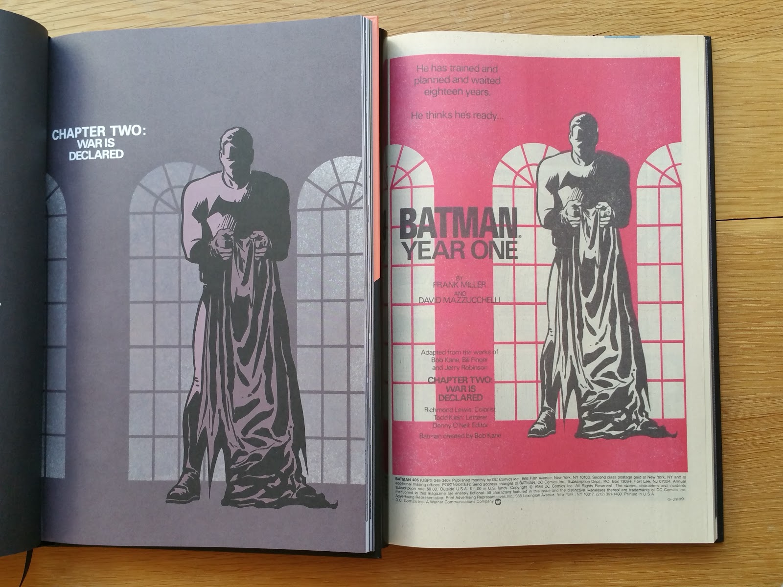
Original covers in virgin form, as well as chapter breaks are included in this absolute edition.


Here is a comparison with the 2012 Deluxe edition (left hand side) regarding the color rendering.


The 28 pages bonus section at the end of book one is very similar to the one included in the 2005/2012 Deluxe editions i.e.:
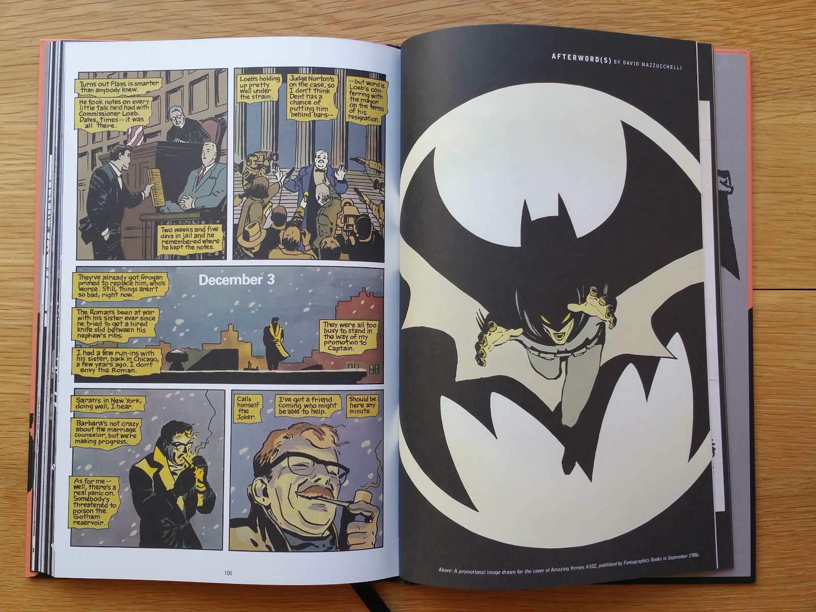
- Afterword(s) by David Mazzucchelli
- promotional image drawn for the cover of Amazing Heroes #102 (1986), used for the cover of the 2012 Deluxe edition
- David Mazzucchelli's 2005 4 page comics about his relationship with the hero and the story,
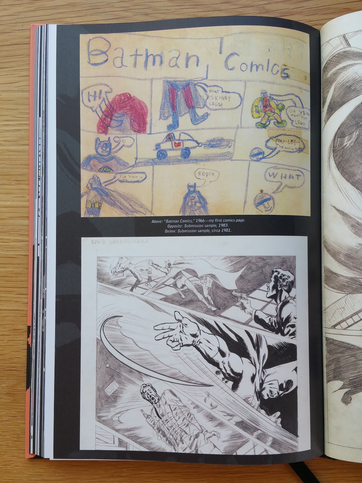
- Mazzucchelli's 1966 first Batman comics page, 1981 and 1983 submission samples
- Three characters researchs illustrations (one is not included in the 2012 Deluxe edition)
- Promotional inserts and stickers
- Commissioner Gordon illustration for Who's Who (Update '87 #2, not in the 2012 edition)
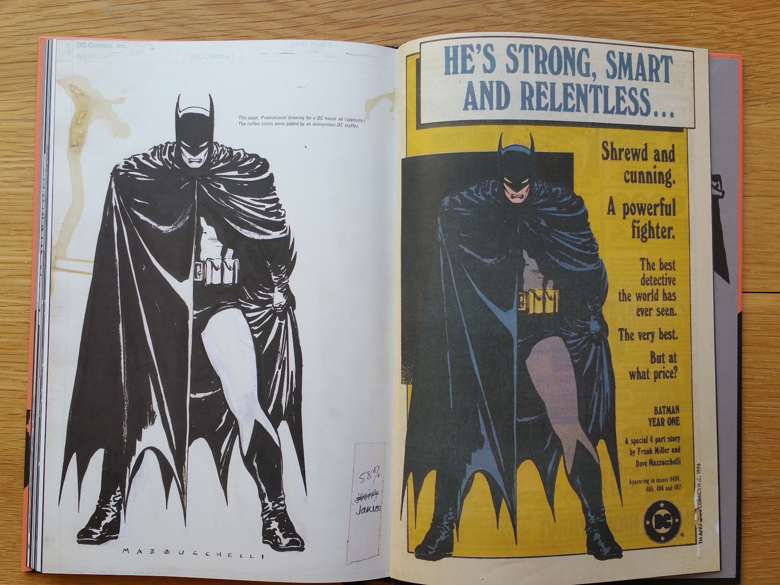
- Promotional drawing with coffee stains and it's final printed colored version
- Four stages of a page progression (#404, page 8, not in the 2012 edition)
- Final inked artwork vs newsprint colored version
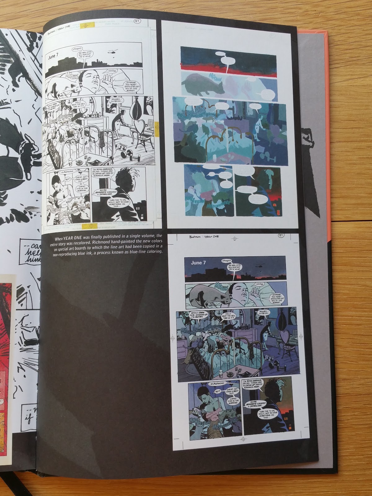
- Richmond Lewis colorization process for the collected edition, with finalized page (the later was not included in the 2012 edition)
- Original drawings for the covers of the 1988 HC edition, 1988 TPB collected editions (Warner edition and DC editions), and 2005 second DC hardcover edition design by Chip Kidd
Notice that the 2005/2012 Deluxe editions also contain the four original covers, some of the original pages from the newsprint original floppies, as well as 12 pages of scripts and layouts excerpts that can be found in book two of this absolute edition. Nonetheless, some material featured in the 2005/2012 Deluxe editions are not include in this absolute edition:
- an excerpt from original ink artworks (Gordon in his car with a baseball bat).
 |
| Mazzucchelli's 2005 comics |
 |
| character sketches on the bottom right were not included in the 2012 Deluxe edition |

 |
| four stages of a page progression (#304, page 8) |
 |
| bottom right, the finalized colored page was not included in the 2005/2012 editions |
 |
| right hand side, page not included in the 2005/2012 Deluxe editions |
 |
| short authors bios |
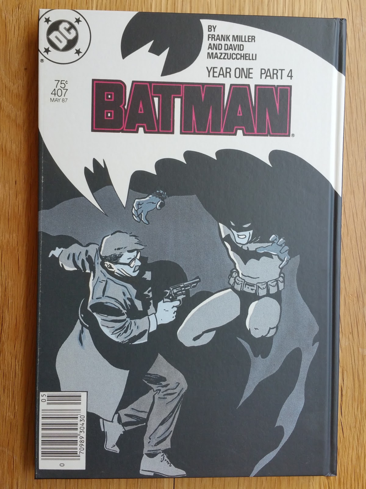
And here is a full description of Book Two (158 pages):

 |
| back cover |
Second and third of cover for this volume are similar to the one used in book one, only here the background is mauve.
If there is a problem with this absolute edition (and I think there is), book two is the perfect illustration of that problem. And I wonder who has the silly idea of proposing a scanned version of the original newsprint comics as a valuable extra (we are talking about a $125 edition)? And why this idea was green-lighted is beyond me...
Original covers as well as letter columns (from issues #408-411) were also scanned from mint-condition copies, but don't expect me to say hurray! for that. And notice that even the paper used for the second book is of significantly lower quality than for book one (thin mat yellowed paper).
Below are comparisons between the original newspaper comics version in book two, and the "newly rescanned" version from the original board in book one.
|
| ... really it is beyond me |

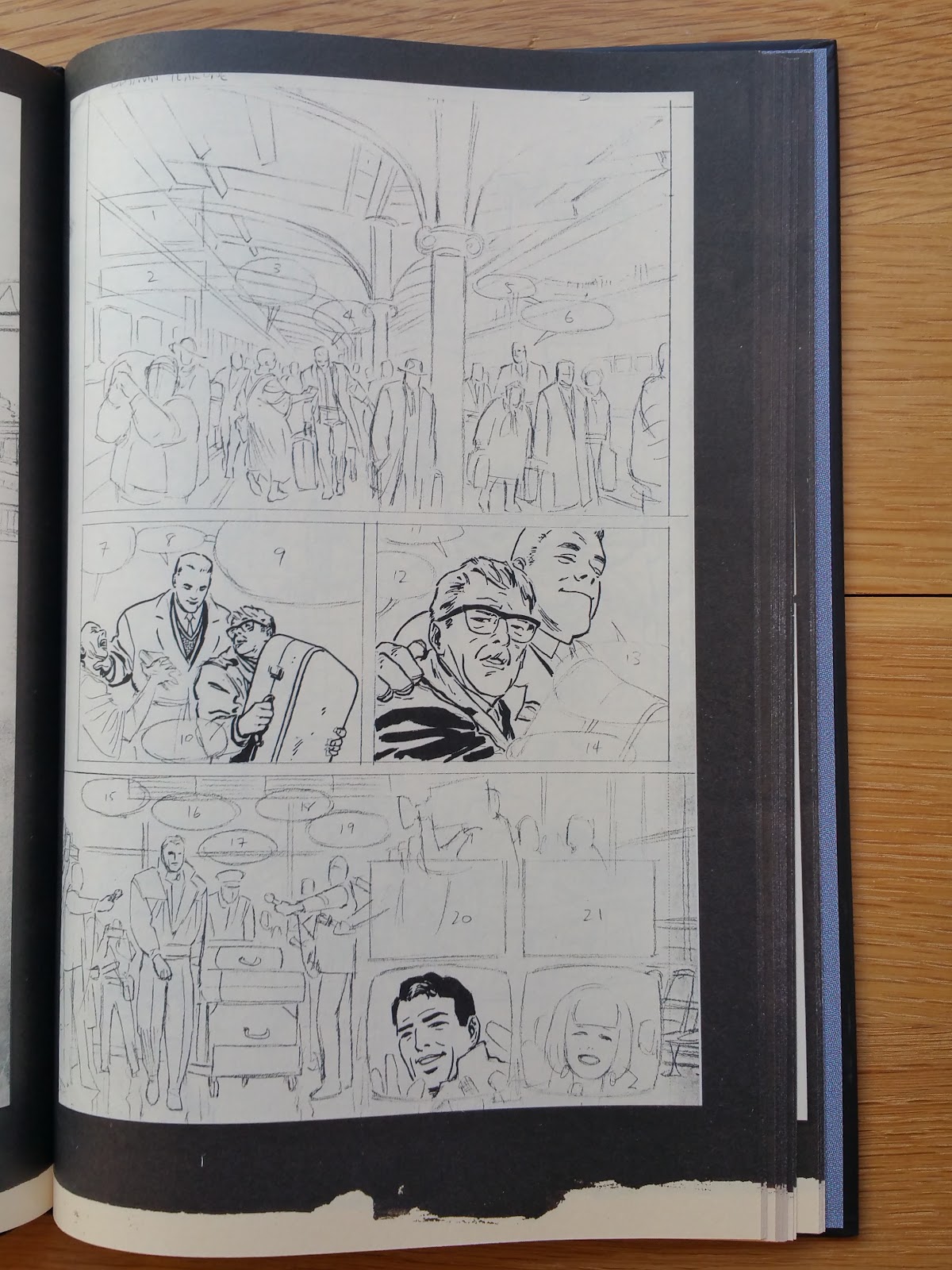
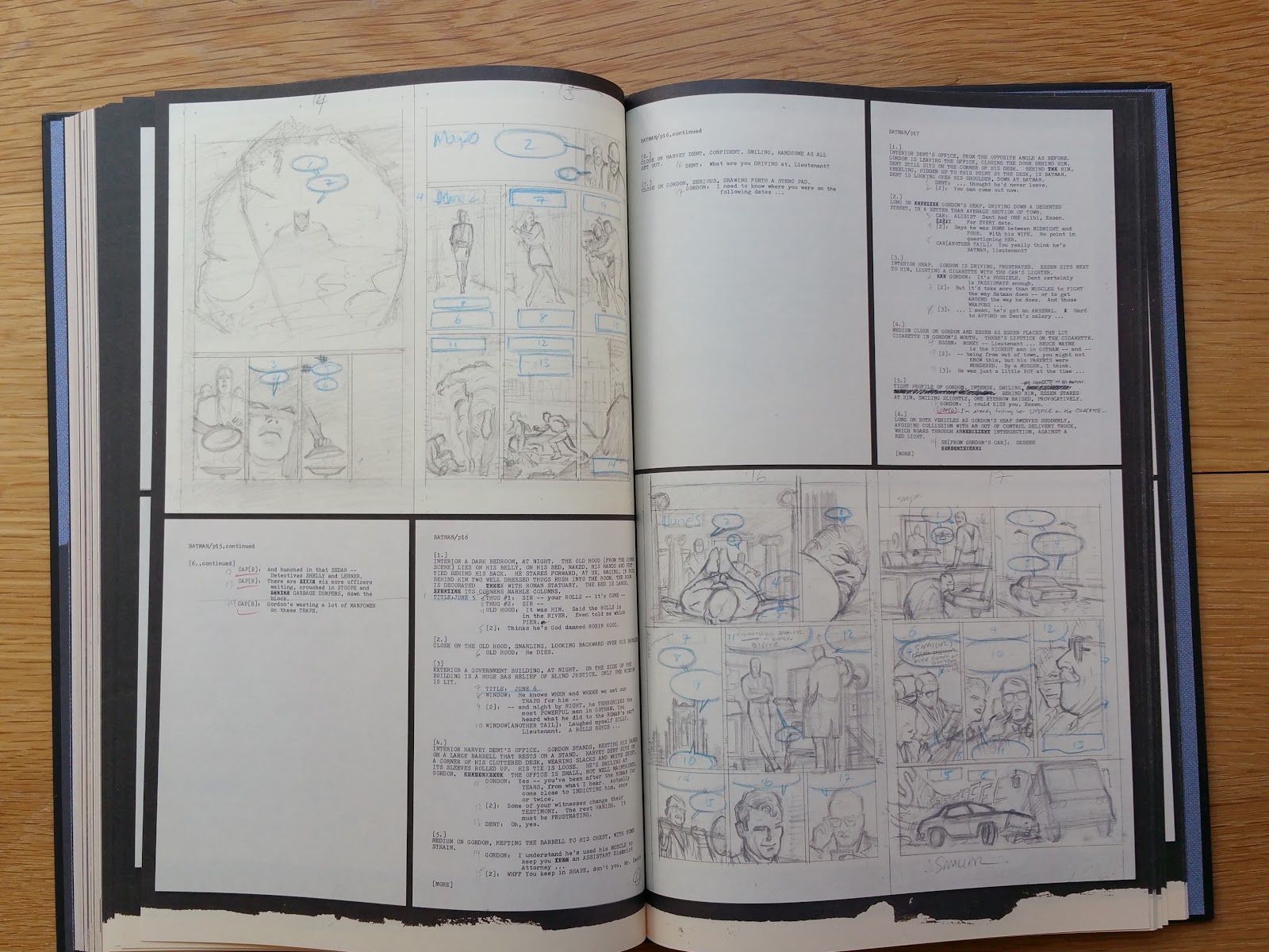
On the other hand, including the complete scripts and layouts is what we can expect for a definitive edition (which that edition is not). But someone had another really bad idea: printing most of the layouts in thumbnail format (although some has been printed in full page size in the 2012 edition), and on thin low quality mat paper.
This is so frustrating, and ultimately sad.
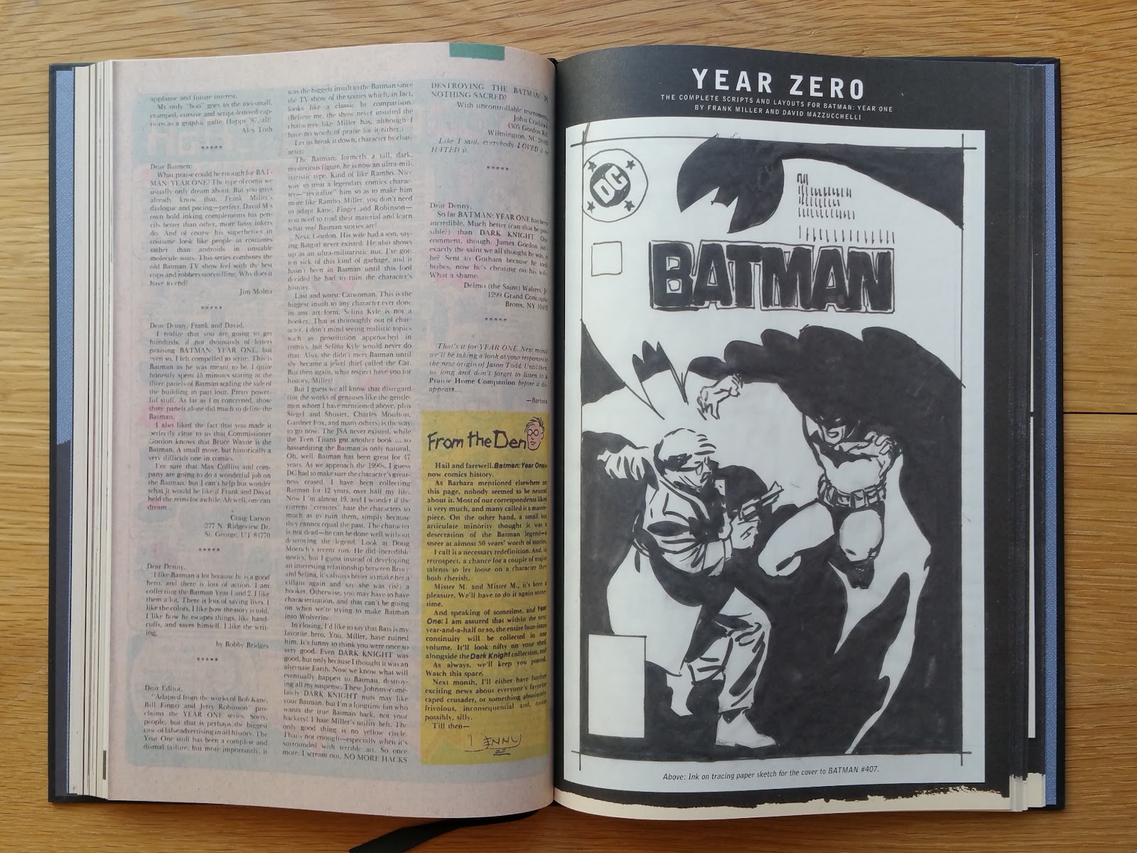 |
| yet it starts well with this ink on tracing paper in full page format |


 |
| and the thumbnails begins .. |
Below is a comparison with the 2012 Deluxe edition (left hand side) that features the layouts in a larger format size.


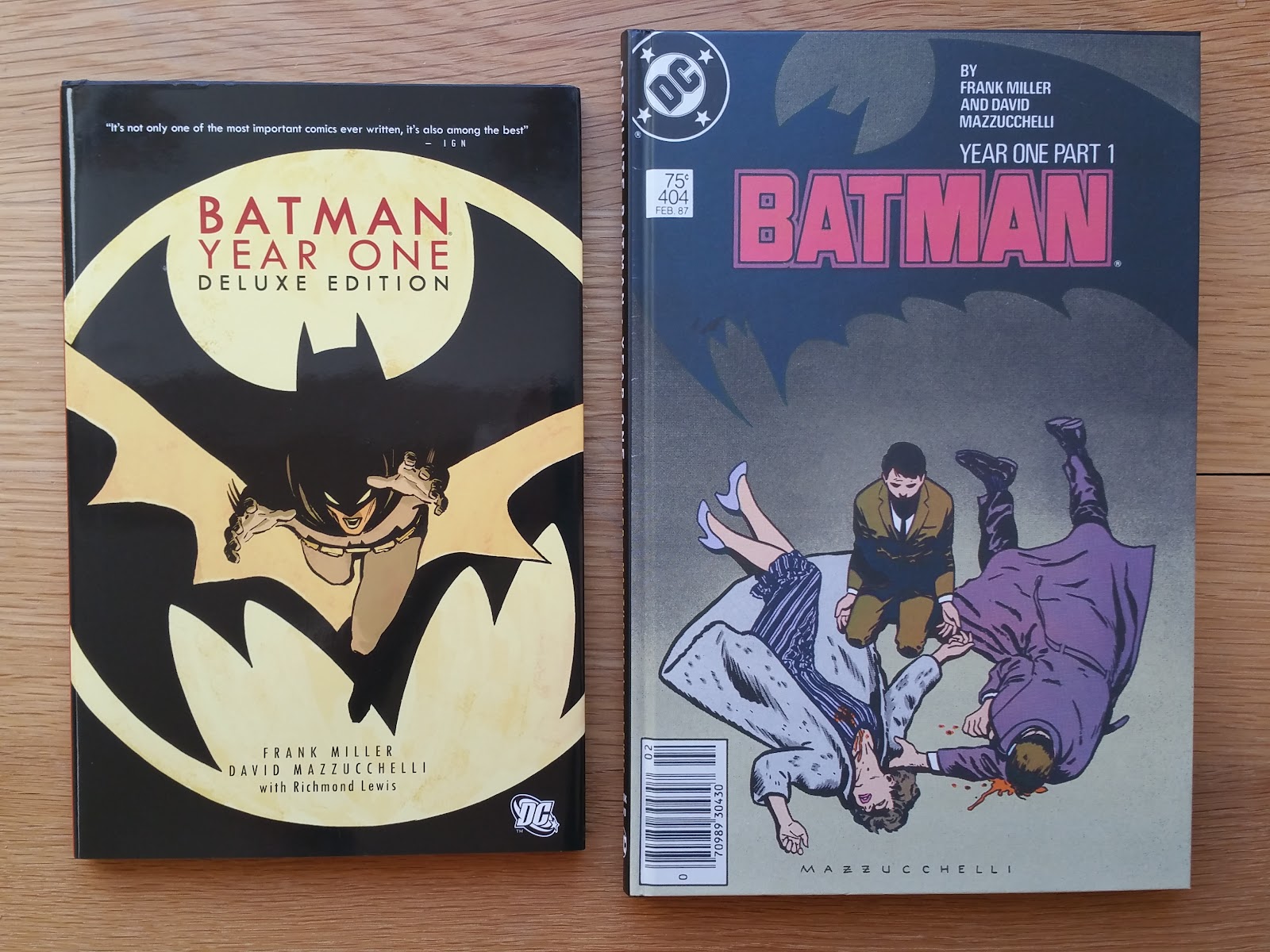
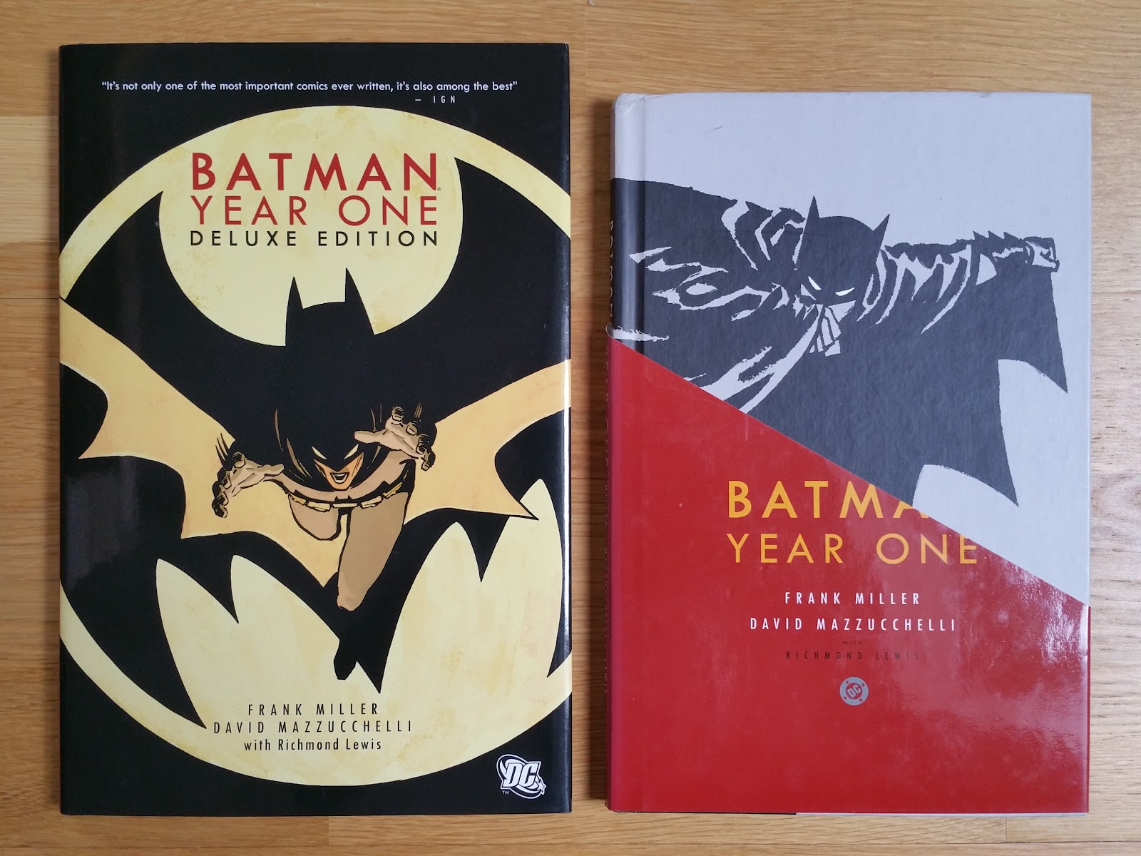
I have acquired recently the 2005 hardcover edition designed by Chip Kidd. It was bought for referenced sake only thus I have settle for a cheap second hand used copy.

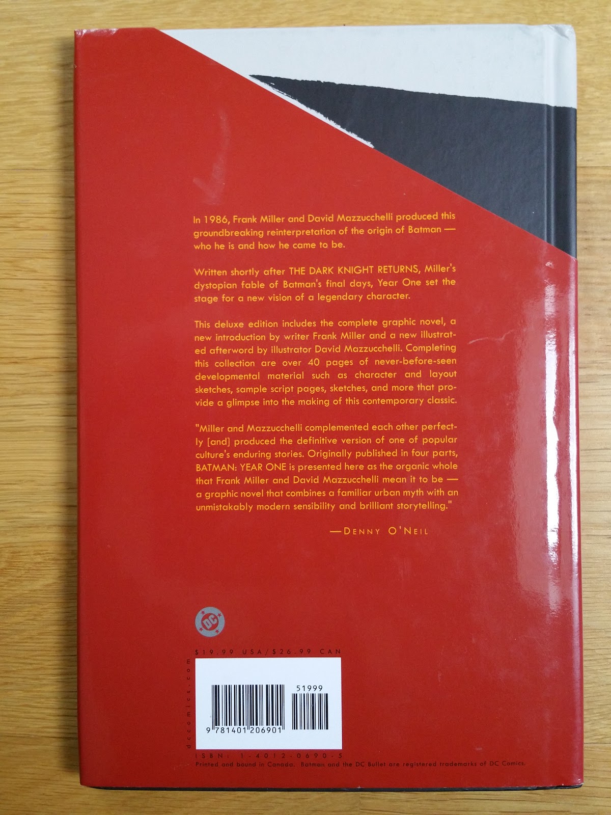
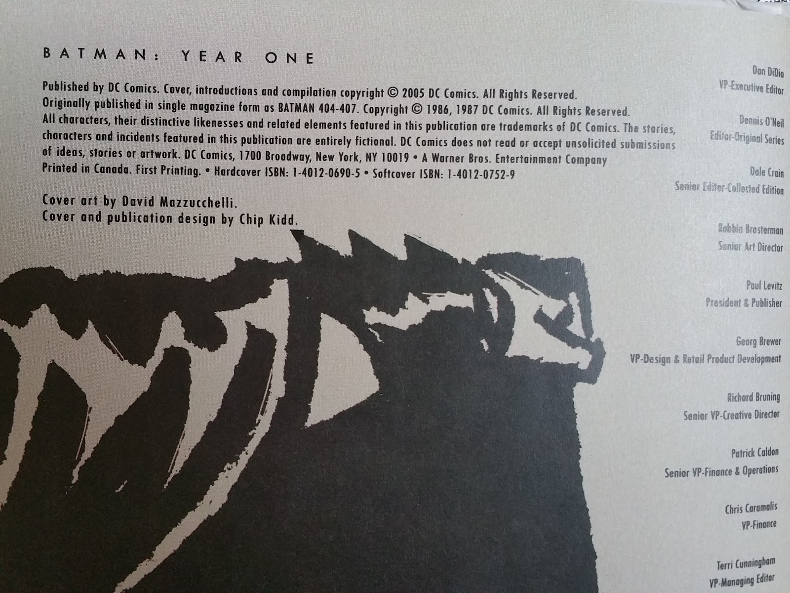
Published in 2005 (ISBN: 1-4012-0690-5, 135 pages, 10.5 x 7 inches or 27 x 18 cm, $19.99 cover price) this edition was overseen by David Mazzucchelli with editor Dale Crain. It features a brand new cover, second and third of cover, the 1988 re-coloring by Richmond Lewis and additional extras not included in previous collected editions. The overall design shows a great unity, starting with the cover/back cover/spine illustration:

Then, second and third of covers are displayed are parts of a bigger illustration.


 |
| glued binding |
After the overall design, the second main thing to notice here is the fact that this 2005 edition was printed on very slightly brownish mat paper, while the 2012 edition was printed on glossy bright white paper. Hence, although both editions feature the same coloring, colors are not toned down in the 2012 deluxe editions, as they were in the original comics. On the examples below the 2012 edition is on the left hand side, and the 2005 edition on the right hand side.


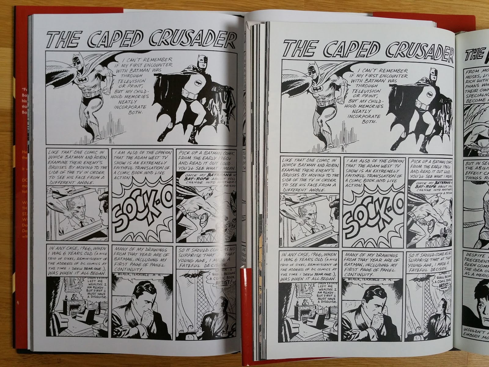 |
| the 2012 edition uses plain white glossy paper |
The third thing to keep in mind (besides the 2012 edition being bigger and having a canvas hardcover), is that the two editions have the exact same content (main part, introduction, afterwords, extras), so I haven't take any pictures specific to the 2005 editions (they are featured in the next section for the 2012 deluxe edition).
And here is the 2012 Batman Year One US Deluxe Edition detailed description.


Published in 2012 by DC (ISBN: 978-1-4012-3342-6, 11 x 7.5 inches or 28 x 19 cm, 135 pages, cover price $24.99), this deluxe edition comes with a fully illustrated jacket and an embossed canvas black hardcover. It is printed on thin glossy paper and features a glued binding (printed and bound in the USA). Notice that this deluxe edition is bigger than the 2005 Chip Kidd edition:
Through the comments section of this article, The Passenger drew my attention to the fact that David Mazzucchelli is really not pleased with the 2012 version (see also this link):
"I didn’t even know they were making it, and I don’t understand why they thought it was necessary — several years ago, DC asked me if I’d help put together a deluxe edition of Batman: Year One, and Dale Crain and I worked for months to try to make a definitive version. Now whoever’s in charge has thrown all that work in the garbage".
Indeed the 2005 unified design from cover to the interior opening pages has been ignored, and second and third of covers are now both plain black (i.e. part of the second of cover and all third of cover of the 2005 edition are missing).


The 38 pages extra section produced by David Mazzucchelli (plus the 1988 Frank Miller afterword) feature rough layouts paired with Miller's script, covers gallery, pencils and recoloring process examples. It begins by a 4 pages B&W comics produced in 2005. All four original covers from Batman #404-407 are reproduced as well as covers for the first single volume reprints.


 |
| left original coloring |
 |
| dust jacket illustration for the 1988 HC reprint |
 |
| left Miller's afterword |
I disagree with you about the paper quality and 2nd book in general. The price of the total collection is much too high (should be $75 max in my opinion), but those original versions with the original colors are very different and there is a completely different feel to them. I like both versions very much. For the original colors, you *need* something to replicate the original paper. In fact, the reason I don't buy so many reprints of old comics (pre-1990 comics) is that reprinting them on glossy ultra-white paper stock, they look nothing like the originals. That's why I appreciate when they print on original stock when appropriate, like in this volume and in the Kirby omnibuses. To give an example of what I think looks poor -- take the Frank Miller Daredevil omnibuses. They are printed on thick, glossy, white paper, and the comics have none of the feel of those original issues.
ReplyDeleteYou compare here to the 2012 version of Year One, which is terrible and that Mazzucchelli himself complained about. Much better is beautifully hardcover designed by Chip Kidd from 2005. That's where most of the extras from the subsequent editions come from.
Hi Josh and thanks for commenting, and know that you are not the only one that have a different opinion on this second book (I had a similar discussion on a French Forum and CBR community). To better explain my feeling, I do not mind having the original coloring. What makes no sense for me is why propose at such a high price something that you can find on ebay for less than half the price of this absolute edition. Following your arguments, what would have make sense for me is using the clean B&W version and pay someone to redo the original color on thick yellowish paper. But here we have hi res scan of poor printing quality material with drooling colors and fuzzy lines, and thin paper.
DeleteI agree 100% of your second comment and a copy of the 2005 Chip Kidd edition is on its way (find a low price copy on ebay a few days ago). An update will follow in the forthcoming weeks.
cheers
What have you heard about the September 2017 New Edition Deluxe Hardcover Edition?
ReplyDeleteHi! Just wanted to thank you for all of these very thorough reviews you've done here. Absolutely incredible and valuable work from you. When you are making investments on books with a price like this it is so good to know what you are getting. Once more: huge thank you!
ReplyDeleteI have a question. Can you take a picture of the script pages for the mayor's mansion scene? I'm curious about something.
ReplyDeleteHi, no problem. I haven't read it in a while can you tell me in which chapter/part is this scene?
DeleteIt starts on page 10 of chapter 2 (issue 405). It's dated May 19. It starts outside a big mansion and they mayor, Commissioner Loeb, and Roman are there and Batman blows up the wall and tells everyone their days are numbered.
DeleteHi. I have taken the pictures, can you use the contact form to pass me your email?
DeleteHi, could you please take pictures of the script featuring the scene depicting Bruce in Wayne Manor seeking inspiration and the bat flying in at the end of issue #404?
ReplyDelete